


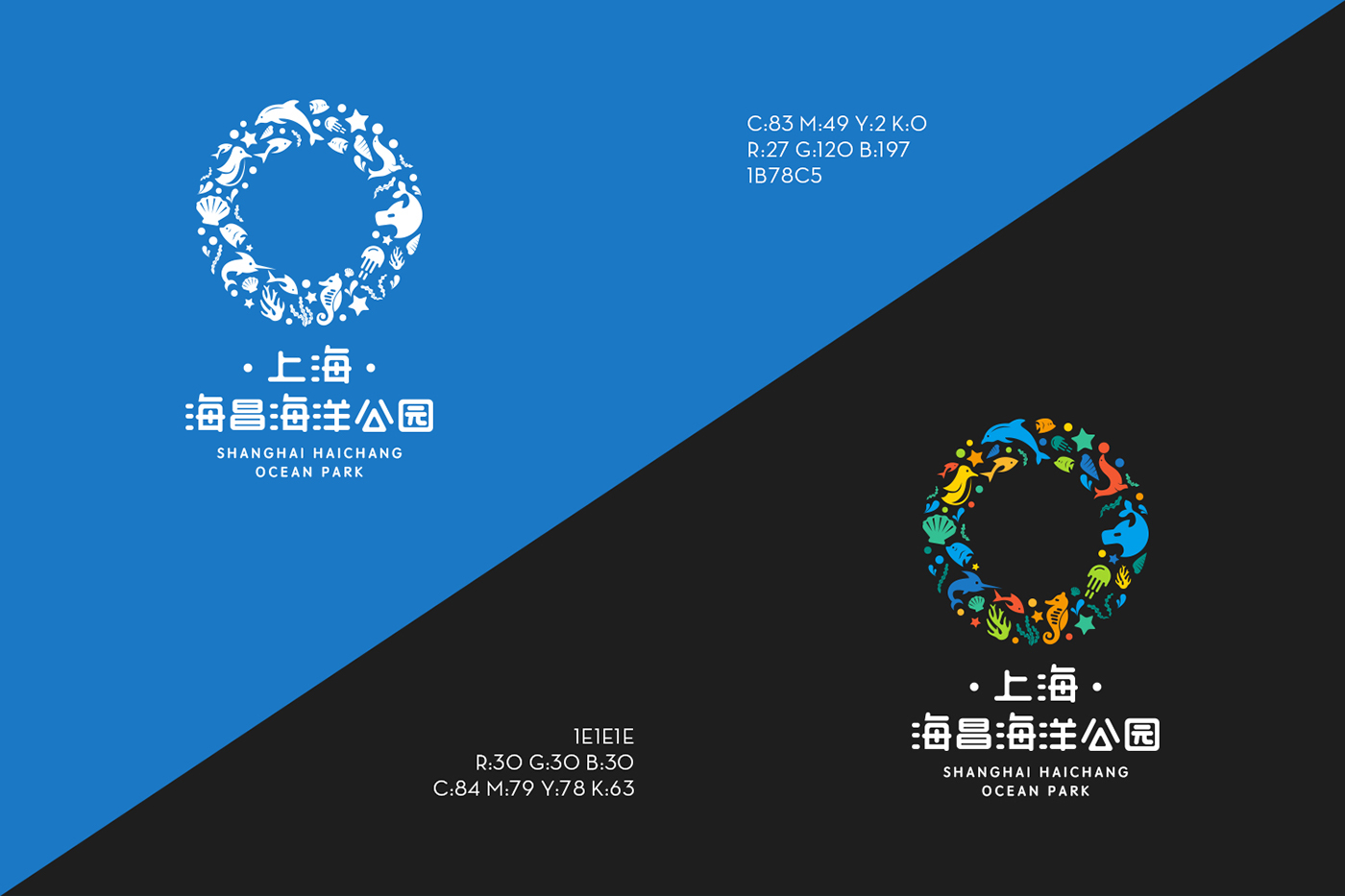


关于LOGO设计理念:
O × CEAN / Ocean circle
1、寓意:海昌海洋公园作为魔都上海的新地标,打造都市人们新的娱乐度假“圈”,同时也是海洋生物在上海的一个生态“圈”,体现人与海洋生物的和谐共处。
2、形状:LOGO由许多的海洋生物汇聚而成的一个“O”(圆圈)的形状,一方面代表海洋Ocean,另一方面代表公园(圆)的寓意。
3、色彩:LOGO采用丰富欢乐的色彩,能够直观的给人了解园区拥有丰富的体验项目和海洋物种,以及充满乐趣的游园体验。
4、风格:LOGO采用扁平的组合风格,变化性强,可衍生许多组合形状,具备时代感和国际感。
5、拓展:LOGO的圆圈可以是“鱼儿吐的小泡泡”、“海狮嘴上顶的球”、“海豚跃起穿过的铁圈”等等。
1, meaning: a new landmark as Shanghai Haichang Ocean Park in Shanghai, to create urban people's new entertainment resort "circle", is also a marine ecological "in Shanghai circle", the harmonious coexistence embodied with the sea creatures.
2, shape: LOGO by many marine organisms gathered into a "O" (circle) shape, on the one hand represents marine Ocean, on the other hand represents the meaning of the park (round).
3: Color: LOGO uses rich and colorful colors, intuitive to understand the park, has a wealth of experience projects and marine species, as well as the fun of the garden experience.
4, style: LOGO uses a flat combination style, variability, can be derived from many combinations of shapes, with a sense of the times and the international sense.
5, expand: LOGO circle can be "fish spit bubble", "sea lions mouth on the top of the ball" and "Leaping dolphins through hoops" etc..

